Turning Day to Night In Photoshop: Building a Scene

Creating a realistic nighttime mood can be a challenge. Lighting in the dark can be a big endeavor, from getting enough light to your camera, maintaining detail without sacrificing quality, the size & shape of your lighting (especially if you're working with a wide scenic shot), to the limitations set by your own human eyes. Turning day to night in Photoshop can be an undertaking as well, but understanding how light behaves at night makes it that much easier.The way humans see at night is physically different than how we see during the day; as our eyes adapt to seeing in darkness warmer colors like red, then yellow, are not perceived as vividly. This shift causes moonlight to seem more blue to the human eye, even if it doesn't appear that way on camera, so recreating that color palette helps to build a more authentic effect to your audience. Your color range becomes much more subdued and narrow, with a focus of cooler blues, greens, or even purple depending on the mood you want to achieve.
The light from the moon itself is also very different from the sun. It's a smaller and less vivid light source, and doesn't create the same direct overhead lighting you see in broad daylight. Everything is more dim, and you lose the harsh contrast that brings out fine detail. Artificial light sources like lamps, or a doorway are more pronounced than they would be during the day, and can create pockets of color and contrast that aren't otherwise reflected in the scene.This composite image of my daughter is one of my favorite day for night images. The original photo was shot at golden hour to capture that low, moody backlight to emulate moonlight & the light from the Will-O-Wisp (it took a long time of chasing my toddler around our yard to get the right shot). I wanted to rest of the scene to have a mysterious and low-contrast feel, so I avoided a backplate with distinct shadows, instead choosing something more muted. I rounded out the effect with some silhouetted details in the foreground to add depth to both the scene itself and to the lighting.

© Bekka Björke
Below is a close-up view of the finished composite. The image is pretty evenly exposed as I didn't want to clip either highlights or shadows and lose any detail. You can click the images to view them larger.

© Bekka Björke
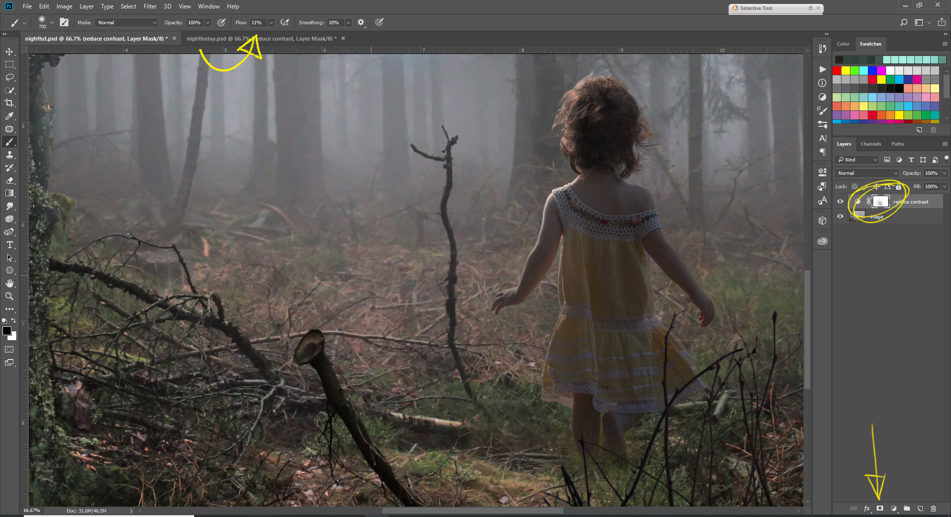
1. The first step to is then to lower the contrast and darken the scene a bit more. Create a new curves layer (New Layer button at the bottom of the Layers Panel), and drag your highlights down, but lift the shadows a tiny bit. This of course will vary based on the image, but you want to maintain some of the detail in your shadows, not crush them.

© Bekka Björke
2. Because I have a distinct light source in this image (the Wisp), I very faintly masked off around the light by adding a layer mask to the Curves layer and using a very low flow (11%) soft brush. This can be applied to light sources in other images, like streetlights, or windows, or anything bright in your scene to help illuminate and draw focus.
© Bekka Björke
3. I wanted to bring just a
little
more drama around the light source, so I added in a a new Gradient Fill layer, with a soft radial black gradient to create a bit of a vignette. Again, I added a Layer Mask and painted off only over the brightest areas of light, then lowered the layer opacity to 72%.

© Bekka Björke

© Bekka Björke
4. Now, to bring in some color! Photoshop has some great Color Lookup Tables (LUTs) built in already, and the Night From Day LUT is one of them (with some tweaking). LUTs are a fantastic tool when color grading, as they remap the colors in your image directly in a non-destructive way. For this first step in color head down to the New Layer menu, select Color Lookup Table, then select Night From Day. Change the layer blending mode to Color. This applies a moody, desaturated blue hue to the image, and replaces any bright whites in the image with a softer light blue, as white doesn't appear quite so distinctly at night.

© Bekka Björke
5. Then, to create some contrast. I created a copy of the Color Lookup layer, but changed the blending mode to Soft Light. This allowed me to keep that Night From Day tonality, with an added contrast boost, but without a potentially destructive or complicated Curves or Levels adjustment. By separating the Color Lookup layer in two it allowed me greater control over the color & contrast separately. I then lowered the opacity of that second layer to a less dramatic degree (in this case 68%).

© Bekka Björke
And there you have it! A finished day to night conversion in just a few steps!